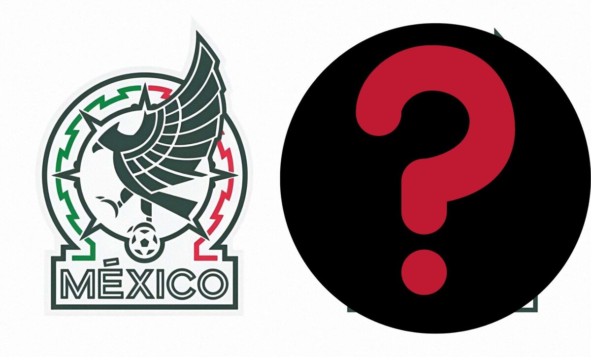
The Mexican National Football Team will showcase a new emblem starting this year, after the Mexican Federation decided to make adjustments to the logo adorning the Tricolor jerseys. Through social media, users have begun to compare the change experienced by the emblem that identifies the Aztec team and the Mexican Football Federation itself.
At first glance, the change is not noticeable, but the modification focuses on the typography of the word 'Mexico', which has abandoned the outline to opt for a solid form, meaning the letters are filled in. Additionally, the Mexican National Team has started to use this new design on its digital platforms, along with an adjustment in colors, abandoning red and white to show only two shades of green.
This adjustment marks the first modification to the most recent emblem of the Tricolor, adopted since December 1, 2021. Since the presentation of the new logo in 2021, fans expressed their disapproval of the design that represents an eagle over a ball with pre-Hispanic touches. Most supporters preferred the emblem used between 1978 and 2021, which, despite undergoing certain transformations over the years, always maintained a recognizable style and identity for the national team supporters, who felt identified with it.


